E-Commerce Redesign

SnusHero

Behavior-Driven Redesign
for an E-Commerce System

Behavior-Driven Redesign
for an E-Commerce System

Full redesign of a digital shop:


brand identity, information architecture, conversion flows, and a scalable UI system
— from a fragmented experience to a coherent product.

Product Design

product strategy

ux research

brand Strategy

ia

conversion flows

content audit

01

·

Context & Strategy

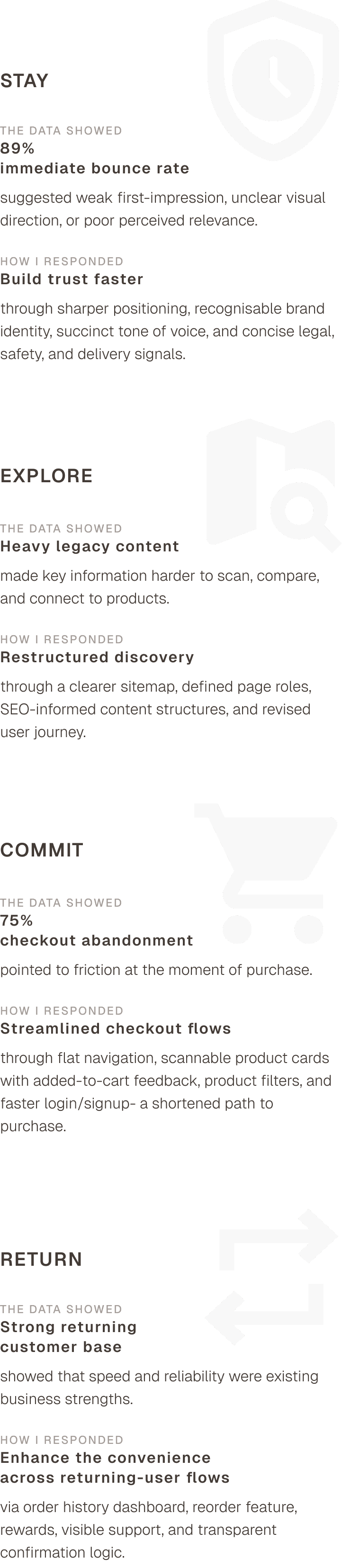
The redesign was organized around four behavioural goals— stay, explore, commit, return.

SnusHero is an e-commerce platform for snus and nicotine pouches.

I led the product experience strategy and redesign.
Worked with the CEO and founders to help turn a fragmented shop experience into a coherent product system across brand, content, navigation, checkout, account, and loyalty.


The map below connects the observed signals to the strategic direction and design response.

SnusHero is an e-commerce platform for snus and nicotine pouches.

I led the product experience strategy and redesign.
Worked with the CEO and founders to help turn a fragmented shop experience into a coherent product system across brand, content, navigation, checkout, account, and loyalty.


The map below connects the observed signals to the strategic direction and design response.
Research inputs shaped the tactical approach:

Stakeholder alignment workshops

Founder workshop

Guided brand story exercise

Tone & Slogan Workshop

Behavioral data

Heatmap analysis

Customer support messages

Google Analytics

Hotjar session recordings

WooCommerce data review

Market & content analysis

SEO research

Competitor analyses

SEO research

Content audit

Short customer survey

Social & cultural research

Snus perception research

02

·

Brand recognition

Comic-Book Visual Language for Brand Memorability

Starting direction

  • Redesign the existing blue-haired mascot.

  • Move toward a more serious and credible brand impression.

  • Use a minimalistic visual style with few colors.

  • Appeal to the main customer base: young male users aged 18–24.

  • Retro authenticity and strength became important cues for the visual direction.

Starting direction

  • Redesign the existing blue-haired mascot.

  • Move toward a more serious and credible brand impression.

  • Use a minimalistic visual style with few colors.

  • Appeal to the main customer base: young male users aged 18–24.

  • Retro authenticity and strength became important cues for the visual direction.

snushero original design
The original SnusHero mascot & logo

Draft 1
Strong & Serious

Explored a more powerful, grown-up mascot direction.

Feedback

Too serious. The founders wanted to explore a more symbolic and minimal direction, closer to recognizable mascot brands like Starbucks or Pringles.

Draft 2a
Minimal Contour Symbol

Reduced the mascot into a cleaner, more symbolic mark.

Feedback

Too restrained. The founders wanted more color, contrast, and visual energy.

Draft 2b
Minimal Mascot with Contrast

Added stronger contrast while keeping the direction simple and recognizable.

Feedback

The founders wanted more snus-related elements and a full-body mascot that could carry more personality.

Final direction:
Comic-book brand world

To justify a richer hero image with snus-related details, I moved from a standalone mascot toward visual storytelling. The comic-book direction allowed the brand to become a small world across the website, with page-specific illustrations that created continuity, playfulness, and memorability.

Redesigned Landing Page SnusHero

New designs for FAQ, Customer Support, Confirmation Screen, and Profile

As a playful account moment for returning users, I explored a set of randomized superhero avatars assigned at each login — a small novelty reward connected to the shop’s brand world.

As a playful account moment for returning users, I explored a set of randomized superhero avatars assigned at each login — a small novelty reward connected to the shop’s brand world.

Visual development workflow

Pen&Paper for ideation, AI for image exploration, Adobe Illustrator for refinement and original asset building, Figma for layout and system integration.

03

·

IA & Content system

Content Architecture for
Search, Comparison, and Conversion

The existing website already carried search value, but the content structure made it harder to scan, maintain, and connect to product decisions. 


Before moving into detailed screen design I treated content as a product layer that had to support search visibility, page comprehension, product comparison, and conversion.

I.

Audit: valuable content,
but structurally messy

  • SEO-heavy text blocks, with pages reaching up to 20k words

  • Weak scannability and unclear content hierarchy

  • Poor semantic HTML and heading structure, including pages with up to 24 H2s

  • Product names and key terms not technically emphasized enough

  • Keyword value at risk, including high-value titles enclosed in non-semantic span elements

II.

turned copy into
governed content system

  • Reduced copy volume after SEO and keyword research

  • Created SEO-informed content structures

  • Defined HTML heading hierarchy rules

  • Mapped keywords by page type and heading level

  • Established tone, formatting, and content rules

  • Documented implementation guidelines for developers

III.

clarified page roles and
reduced complexity

  • Identified overlapping and repetitive pages

  • Mapped 23 page types and 43 subpages

  • Reduced the structure to 9 core page types

  • Created core page documentation

  • Developed a shop filter feature

  • Enabled clearer navigation logic across shop, product, brand, support, and checkout paths

Aligning Content with Strategy, Technical Structure, and Implementation

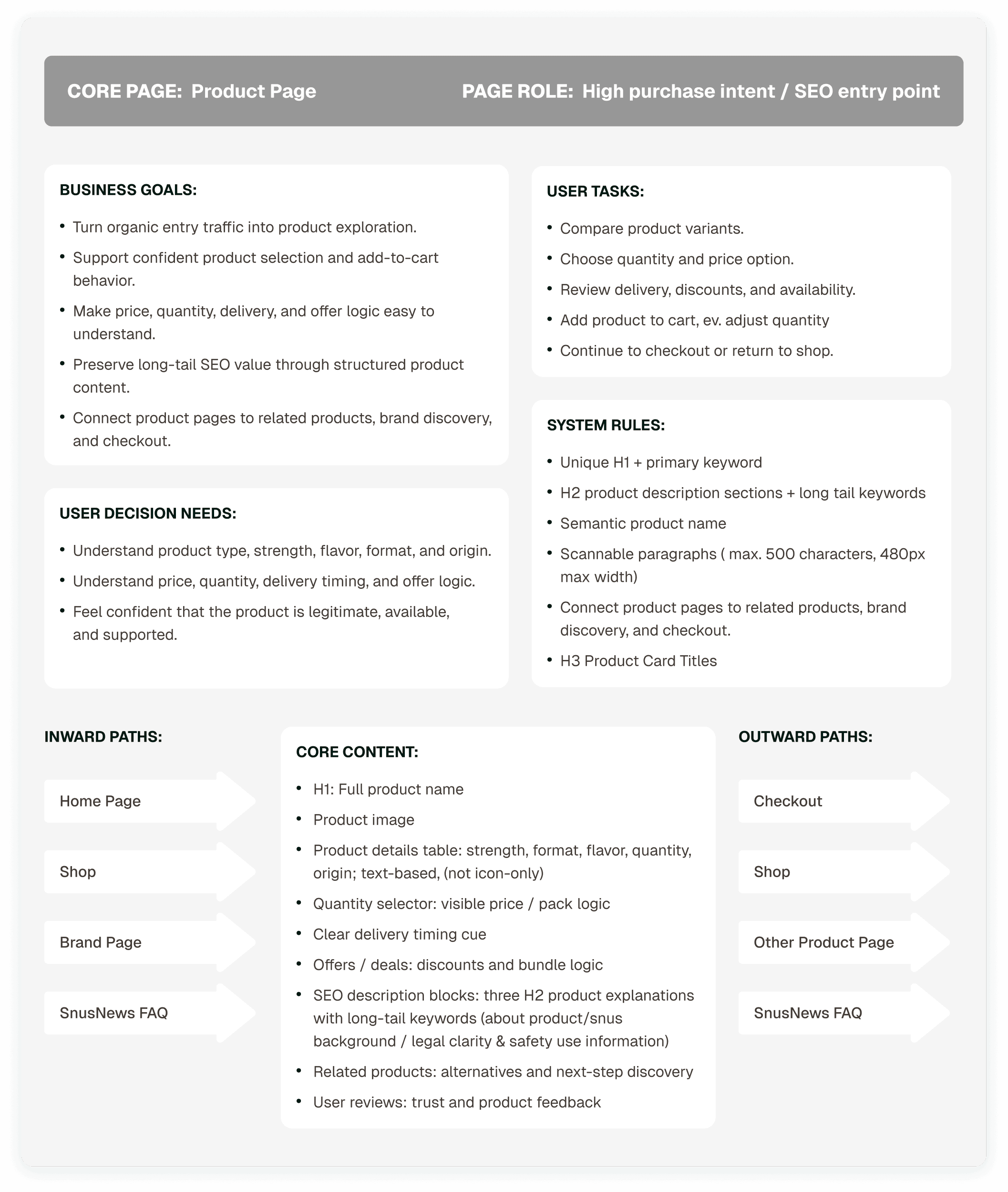
Before moving deeper into screen design, I used core page documentation for each page type to connect business goals, user decision needs, user tasks, SEO structure, content hierarchy, inward/outward paths, and developer rules.

Product Page- example from the core page documenation

04

·

Conversion &
Account Flows

Conversion & Account Flows

Designing Faster Paths to Purchase and Return

The redesign treated checkout, account access, and order management as one connected return system. 


The goal was to reduce repeated effort for users who already knew what they wanted, while keeping purchase, delivery, and support information clear at each step.

Account entry as checkout infrastructure

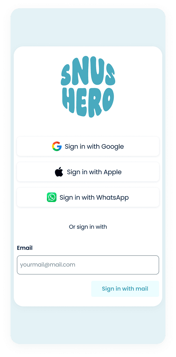
I simplified account access by resolving multiple sign-in cases and connecting login to existing user behavior.

Cart-aware product cards

I redesigned product cards to make cart status visible during browsing. Users could immediately see which products were already added and in what quantity, reducing uncertainty when comparing or continuing to shop.

Making Repeat Checkout Easier

Because SnusHero already had a loyal returning-customer base, the checkout flow needed to support repeat purchase without unnecessary re-entry. 


Saved addresses, reusable payment methods, and clear order visibility helped users confirm the same delivery setup or quickly edit details when needed.

Making Repeat Checkout Easier

Because SnusHero already had a loyal returning-customer base, the checkout flow needed to support repeat purchase without unnecessary re-entry. 


Saved addresses, reusable payment methods, and clear order visibility helped users confirm the same delivery setup or quickly edit details when needed.

Project status

The redesigned experience is currently in development, with full launch expected in 2026.
My work focused on defining the product experience strategy, content architecture, key conversion flows, and implementation-ready design logic needed to turn a fragmented shop into a more connected product system.

Designed for a wider view!
The remaining sections show detailed product flows and process artifacts. For the best reading experience, please continue on a larger screen.